Ray Guzman: Signs of the Times—Vintage, But Never Dated
by Melissa Abernathy
photos courtesy of Ray Guzman
There’s a local artist whose work you probably know by heart, even if you don’t know him by name. His work appears throughout the Hoboken landscape, visually expressing the essential character of Hoboken: somewhat vintage, somewhat modern—definitely idiosyncratic.
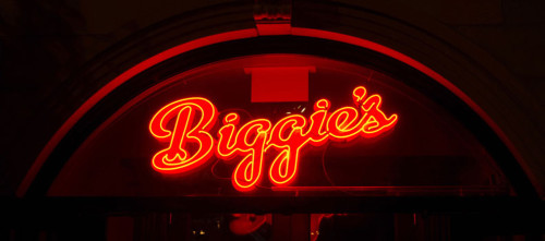
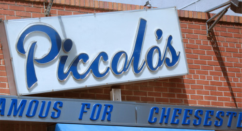
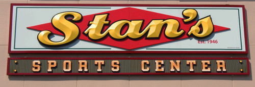
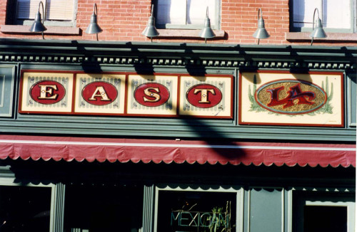
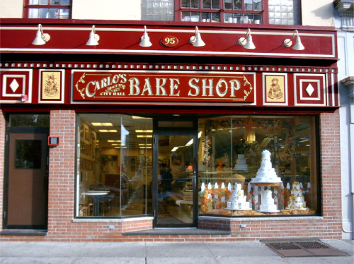
If you have a very keen eye, you might have seen the artist’s “signature” on several of the most recognizable business signs around town. Look for a tiny inscription, “Hoboken Sign,” tucked inconspicuously along the border, the next time you’re passing Piccolo’s, La Isla, Biggie’s, Sparrow’s, Carlo’s Bakery, Stan’s Sports Center, Amanda’s, East L.A. and the Cast Iron Lofts, to name just a few.
In fact, it’s hard to name them all, they’re so ubiquitous—probably close to 500. These signs stand out and blend in at the same time, becoming as much a part of the collective “look” of Hoboken as the ornate 19th century cornices, filigreed ironwork, and a smattering of mid-century and contemporary buildings that define the city.
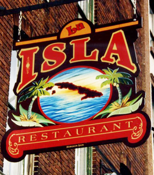
Although many of the signs—La Isla or Piccolo’s, for example—look like they’ve been in place as long as these multigenerational businesses have been around, none of them dates back before 1986, when Hoboken Sign was founded by Ray Guzman. Some are brand new—like the Little Grocery Uptown window sign and discreet hanging sign, or the vintage-style enamel wrap-around sign on the front column of the Elysian Café. Some are intentionally distressed, like the “Restaurant/Cafeteria” sign above La Isla, to appear as though it has always been there. He often uses older type styles that suit the look and personality of the business, such as Amanda’s Art Nouveau-style logo, executed as a vinyl window decal for the Victorian-era storefront, and the 1950s-style font in Piccolo’s sign, on Clinton St. below First St.
The variety of type styles, as well as the period looks, are a testament not only to Guzman’s technical skill, but also to his respect for the signmaker’s craft and for the signs’ need to suit their surroundings. In Hoboken, signs fall under the scrutiny of the zoning office and historical preservation commission. “I manage the whole official review process personally, to make sure everyone’s happy with the end result,” he explains. “After all, I have to live and work with these people too,” he adds with a chuckle.
Signing Up for the Job
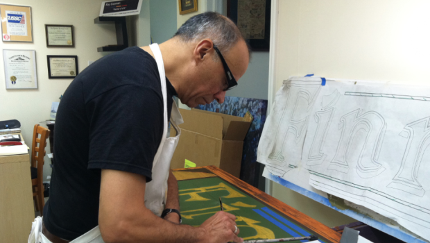
It’s hard to say which came first—how much Hoboken defined Ray’s style as a signmaker, or Ray’s formal training as an artist defined his approach to designing signs. A Bronx native, he moved to Jersey City with his family at age 12, then he eventually moved to the Mile Square City in the 1970s, after earning an art degree at New York’s School of Visual Arts.
The balance of retro with contemporary style is not surprising once you get to know the man behind Hoboken Sign. He once studied wood-block printing with a Japanese master, learning how different conditions can vary the outcome, even when using the same carving. And an exhibit of Guzman’s watercolor landscapes at the Hoboken Historical Museum in 2006 reflected a similar respect for traditional artistic techniques applied to scenes of modern life, such as construction cranes on the Hudson River waterfront. (If you missed he exhibit, you can see the paintings at www.rayguzmanstudios.com.)
In the 1970s and 80s, Hoboken was a magnet for creative types, offering low rents and lots of empty warehouse space to convert into studios. Along with his wife Renata, whom he met at SVA, the couple started out as mural painters, and evolved into Hoboken Sign by 1986, bringing an artistic sensibility and a deep connection to the Hoboken community to their craft. They have earned numerous awards from sign-industry magazines and associations, both for techniques and designs.
Sign, Sealed, Delivered
The word “iconic” is overused, but that’s essentially what sign artists are tasked to do—create an icon that conveys the personality of a unique business, helping it to stand out from hundreds of other businesses, yet at the same time, blending into the fabric of a community.
That’s a tricky balancing act—one that requires not just solid design skills, but also a deep knowledge of the history of sign-making, the city’s history, its current population, and especially the personality and mission of the business owner. Guzman is a devoted student of his craft, sharing his knowledge in a 2002 lecture at the Hoboken Historical Museum in conjunction with the exhibition, “Signs & Traces,” which featured signs from all eras in the Museum’s collections.
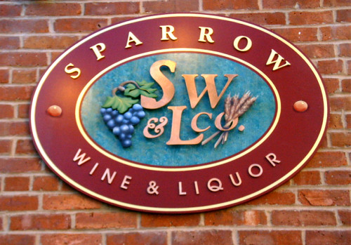
Ray has worked with almost every type of material suitable for storefront signage, preferring materials that have the greatest durability. When Armando Luis took over his family’s liquor store, Sparrow Wines & Liquors, and wanted to shift the emphasis to wine, he renovated his Washington Street storefront with an upscale, solid oak finish. Instead of a backlit plastic sign, Guzman recommended a hand-carved California redwood, which would last longer than other materials, with real gold-leaf accents.
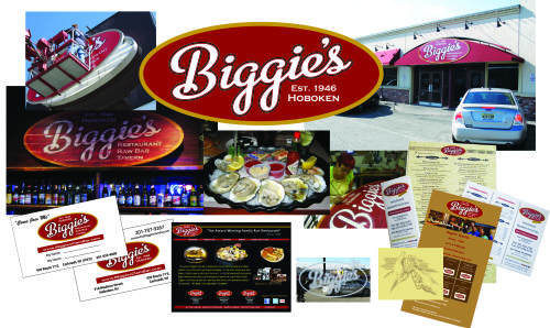
Sometimes, a backlit sign is the right choice for a business, such as Biggie’s new restaurant in Carlstadt, on Route 17, where visibility from a great distance is critical to a restaurant’s success. Or to hearken back to traditional business signage, Guzman will paint a sign directly onto the wall, such as the sign he created for Johnny Pepperoni’s on Park Ave. at 11th Street.
His skill at wall painting was honed through participation in a loose confederation of fellow sign and mural artists, or “letterheads,” calling themselves the Walldogs, a traditional nickname for muralists. The group convenes from all over the United States to collaborate on elaborate wall billboards that capture the historic nostalgia of a particular town or city. Learn more about this fascinating group at www.walldogs.com.
Over time, responding to clients’ requests to adapt their designs in print and digital formats, Renata and Ray launched a related business, Brainwaze Studios, in 1994, to help businesses develop a full brand identity and marketing materials. After losing Renata to cancer in 2009, he put the business on hold, but he’s recently revved it up again— and, despite suffering severe flooding from Superstorm Sandy in his basement-level office in the Citadel building (on 7th Street, between Adams and Jefferson), he’s running at full steam again. He now runs the business with a new partner, Sissi Siska, a textile artist known for her vividly painted silk artworks, created in her studio in the Monroe Center.
For a marketer, Guzman doesn’t really practice what he preaches—he does little or no marketing for his business. Referrals keep him busy, including business expansions, like Biggie’s stores on Route 17, and in East Tennessee.
“Most of my clients are looking for someone who can manage the whole process, and who knows what works in Hoboken, or other towns,” Guzman says. “I want clients who will trust me to deliver a sign they can live with for a long time.”
It’s probably no coincidence that many of the businesses displaying his signs have the same staying power as Hoboken Sign itself, which is approaching its 30th anniversary next year. Most of these businesses share Guzman’s commitment to doing a job right, and doing whatever it takes to cultivate a loyal following. His signs may look vintage, but never dated.
 Previous Article
 Next Article
 HOBOKEN VETERANS’ DAY CEREMONY
  MUTZ IS ALL YOU KNEAD — Hoboken Italian Delis Always Please With the Cheese
  FRIDAYS ARE FOR FRANK: “Nancy”
  FRIDAYS ARE FOR FRANK: “Daybreak”
  “ANGEL EYES”: Frank Sinatra Passes — May 14, 1998
  FRIDAYS ARE FOR FRANK: “Wives and Lovers” (feat. Count Basie)
  FRIDAYS ARE FOR FRANK: “Come Blow Your Horn”
  FRIDAYS ARE FOR FRANK: “Ain’t No Sunshine” (Nancy Sinatra); RIP Bill Withers